↓
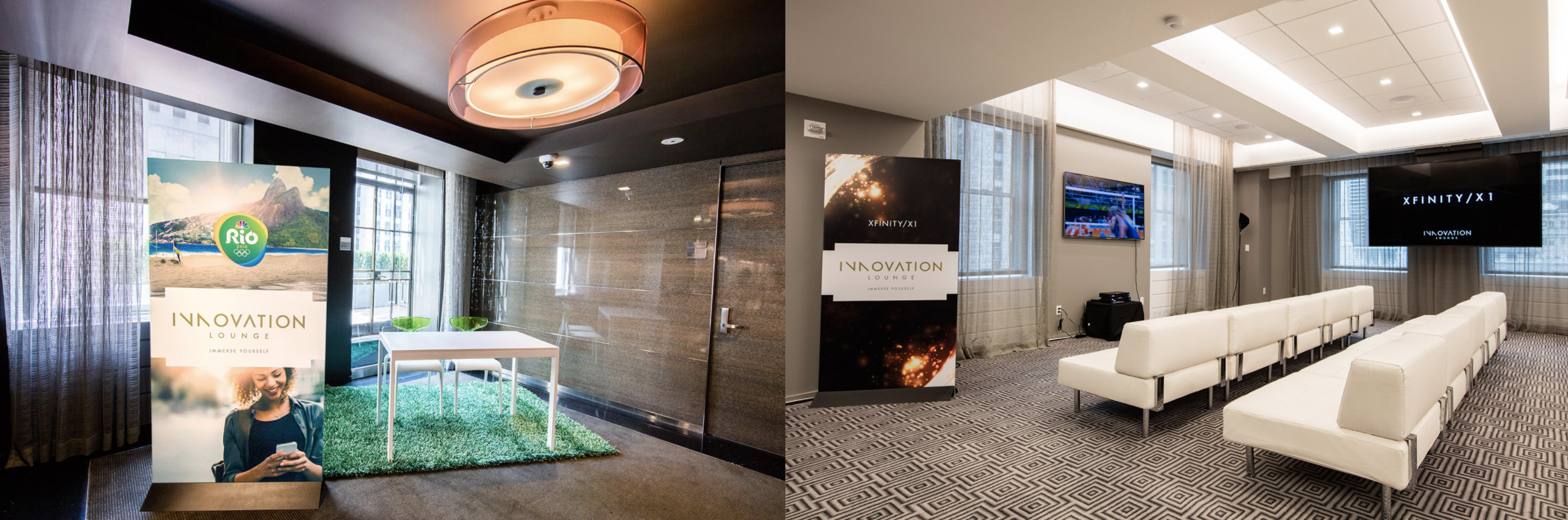
It started with the logo. I chose Futura. While it is definitely not a new font. Sliced and tracked, the mark looked high-end. I cropped the N’s as well making the mark feel electric.
It started with the logo. I chose Futura. While it is definitely not a new font. Sliced and tracked, the mark looked high-end. I cropped the N’s as well making the mark feel electric.